Responsive Web Design Services
Responsive web design is an innovative approach that ensures your website adapts seamlessly to the user's behavior, screen size, platform, and orientation. By dynamically adjusting its layout and features, it delivers an optimal browsing experience across all devices and environments.

Our Development Process
Research and Planning
Understand the target audience, business goals, and content requirements. Identify key elements that need to be prioritized and displayed on different screen sizes.
Wireframing and Prototyping
Create wireframes and prototypes to visualize the layout and structure of the responsive website. Test different design concepts and navigation flows to ensure an optimal user experience.
Media Queries and Breakpoints
Set up media queries to define breakpoints for different screen sizes and devices. Adjust the design and layout based on the screen width to provide a user-friendly experience.
Front-End Development
Code the website using HTML, CSS, and JavaScript, ensuring that the design adapts smoothly across various devices. Test the responsiveness across different browsers and devices.
Testing and Debugging
Conduct thorough testing on different devices and screen sizes to identify and resolve any layout issues or inconsistencies. Check for cross-browser compatibility and ensure smooth functionality.
Mobile-First Approach
Adopt a mobile-first approach, where the design and development prioritize mobile devices. This ensures a solid foundation for responsive design and enhanced performance.
Performance Optimization
Optimize the website's performance by compressing assets, minimizing HTTP requests, and leveraging caching techniques. Improve page load times for a better user experience.
Relax while our web design
professionals handle your
company's needs.
Lorem Ipsum is simply dummy text of the printing and typesetting
industry. Lorem Ipsum has been the industry's.
User Interface Design
User interface design refers to the visual elements of your website. Our UI design philosophy focuses on target customer engagement while ensuring your site’s interface provides a consistent brand image.
User Experience Design
User experience refers to how your visitors interact with the design and structure of a website. Before UX designing, we create a user experience strategy to accurately determine how potential users can navigate through online content.
Technical SEO Consulting
Our technical SEO expertise involves sitemap maintenance, indexing and crawling optimization, canonical tags implementation, bot rendering, URL structuring, tag and image optimization, schema recommendations, and structuring categories and sub-categories.
Single Page Checkout
We know what it takes to improve the shopping experience on eCommerce stores. We can help you design a new site or redesign your existing store to help you provide a single page checkout, include payment options and cross-sell and upsell features and enhance site UX.
HTML and CSS Coding
HTML5 and CSS3 are used today for website development because they permit the automatic webpage sizing and flexible media retrieval required for responsive web designing. We have HTML and CSS coders who customize your website for various screen sizes.
eCommerce and CMS Design
Our talented responsive web design team can convert your existing website into a responsive CMS site. We deliver excellent UX and UI design solutions for eCommerce tools like WooCommerce, Shopify, BigCommerce, Webflow, Unbounce and more.
Our Recent
Project
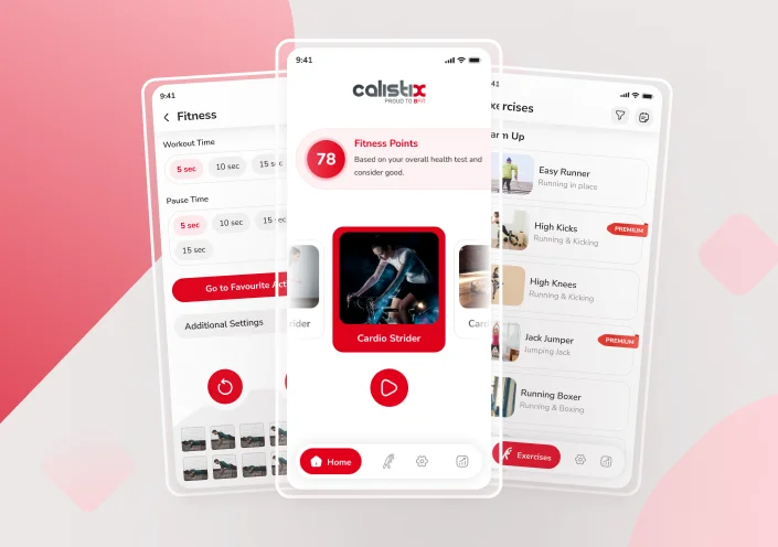
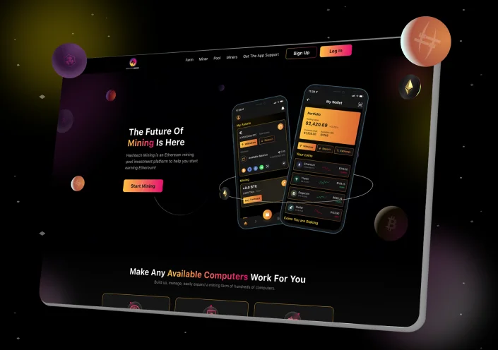
Super Flexible
Consolidating Analytics And Reporting
Easy Navigation
User Experience
Improved SEO
More Mobile Traffic
Benefits of Specialized Responsive Design
Effective Dashboards Key Characteristics
Effective dashboards have several key characteristics that make them valuable tools for data visualization and decision-making. Here are six essential characteristics of effective dashboards
01.
Relevant and Actionable Information
Dashboards display data that is relevant to users' goals and objectives, providing actionable insights for informed decision-making.
02.
Clear and Intuitive Visualizations
Visual elements such as charts and graphs present data in a clear and easy-to-understand manner, aiding quick interpretation and comprehension.
03.
Customizable and Flexible
Users can customize and configure the dashboard to their specific needs, selecting data, adjusting time periods, and modifying visualizations.
04.
Real-Time or Timely Updates
Dashboards provide real-time or timely updates to ensure users have access to the most current information for quick response to changes.
05.
Mobile-Friendly and Responsive
Dashboards are designed to be mobile-friendly and responsive, adapting to different devices' screen sizes and resolutions.
06.
Contextual and Insightful Commentary
Dashboards include commentary to provide additional context, explain data significance, highlight trends, and offer actionable insights.
They All Love our Work
All Around
The Globe
“Really amazing understanding my requirement, I just shared the link of my resource so he can simplify the contents with less brief requirements. i understand that it is not easy to read the whole article and simplify into the social post like this. Brace yourself, I will order more and more...”

Chenkiry (Decathlon)
Business Manager | France
“I have been working with this firm now for about 4 years. They are a group of unbelievably talented web developers. Every time we need work done, both for our website or graphic design they over deliver. We will continue to work with them for all our projects and would highly recommend them to any one looking for top notch work!! These guys are the real deal!! Thanks Team!! 5 stars aren't enough. :)”

Shawn Dixon
My Perfect Neighbour | Canada
“Excellent Company to work with, always deliver more than expected. I really appreciate what they do and the way they do it.”

Eniel Garcia
Mortgage Loan Officer at Philanya, INC.
“I worked with Invints team directly and they were like dreamteam! They understood what I needed, and delivered it quickly - always with an amazing attitude. I highly recommend working with Invints Infotech team, for all of your graphic and web design and web development needs.”

Keelin Clark
Owner of Liberty Empowerment
I was blown away by the work Invints presented to me. I gave them a lot of room to decide themself how to make the Website and they absolutely delivered. If you ever need Websites, Graphics Design, or anything branding related, I would definitely recommend this Company.

Dara King
Reel Black Studios
“This UI/UX service is the best I have ever worked with! Very professional people and have very professional and creative design skills. Always delivered precious work Quality, Honest practices, and affordable prices. It's a rare find on Upwork - I recommend them to anyone looking for great UI/UX ”

Ahmad Elhawli
CEO at Sportsfinda | Sports Tech
More From Us
Brand Strategy
User Experience Design
Shopify Development
User Interface Design
WordPress Development
E-mail Templete
FAQ’S
What is responsive web design services?
Responsive web design services is a clever approach for making websites and applications appealing enough to scale and change their content depending on the screen size of the device. This quickens the development process, manages the project, and improves usability.
How is responsive web design different from mobile-friendly web design?
All screen sizes, including those of a desktop, laptop, mobile device, and tablet, can be viewed on responsive websites. On the other hand, mobile websites are made specifically to fit mobile screens. A mobile website needs more development time but they gets load quicker to deliver amazing UI.
Why responsive web design matters?
Today, having a responsive website is more important than ever, as it offering the same user interface to desktop and mobile consumers. As a website may be built using responsive design so that it automatically adjusts its elements and information to fit the screen size being used to see it.
Why choose Invints for responsive web design services?
Invints is a bunch of smart, creative thinkers, responsible, well-skilled, experience designers, and friendly-communicative teammates and these are the focal reasons to choose us as your responsive web design service partners. Connect with us to learn more about us.